views
Drawing Block Letters
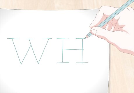
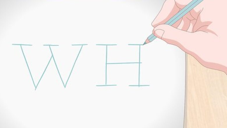
Write large capital letters in the middle of your page with a pencil. It’s also possible to do lower case letters in 3D, but it’s much easier in upper case, because more of the letters have straight lines. Write the letters in pencil because they will act as guidelines. You will erase them later! It may be easier to practice on graph paper. Following the lines printed on the graph paper can help you create nice, even lines for your letters. Be sure to leave more space than you usually would between the letters so that you will have room to outline them.
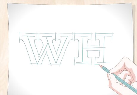
Sketch block outlines around your letters in pencil. If you’re drawing on graph paper, just trace the graph paper in rectangular blocks around your letters. Make sure the letters are all about the same width. If you’re drawing free-hand, it may help to lightly sketch guidelines above and below your letters so that they all end up the same size. For letters with curves, like “C,” try to draw a smooth curve and make the letter the same width as the straight-edged letters. Don’t forget to outline the inside of holes in letters like “R” and “A.”
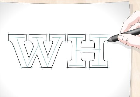
Go over your block outlines in pen or marker to finalize them. Don’t trace over the letters that you originally wrote, just trace over your block outlines. Try to make smooth, clean lines instead of light, feathery lines. Smooth, straight lines will look much neater! If it helps, try using a straight edge ruler. Wait for the ink to dry before erasing your pencil marks so that you don’t smudge the ink.
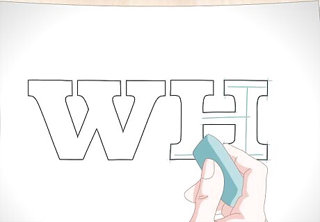
Erase all of the pencil markings. Use a large, soft eraser to erase all of the stray pencil marks and sketched lines. Now all that you will have on your paper are the final block outlines of the letters. Clear away the eraser shavings so that they don’t get in the way.
Adding 3D Perspective
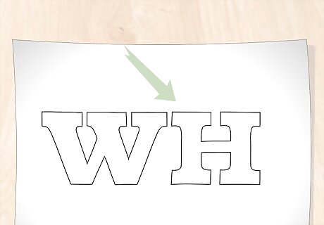
Choose a vantage point for your letters to make them 3D. Decide whether you want to view your block letters from above or below, and whether you want them to face to the right or the left. If you were looking at them straight on from the front, they’d just look like ordinary block letters, so you have to tilt them to make it 3D. Your vantage point will determine the direction you draw your diagonal lines in the next step.
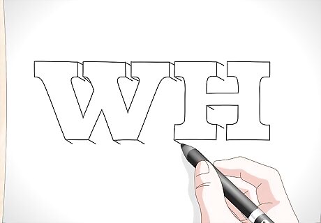
Draw small diagonal lines from the corners of your letters in pencil. Be sure to draw all of the lines so that they tilt in the same direction. If it helps, choose a vanishing point in the background. Then, use a straight edge to line up each line with that vanishing point before you draw it. If you’re viewing your letters from above, the lines should tilt up. If you’re viewing from below, they should tilt down. Draw the lines to the right if you want your letter facing left and to the right if you want them facing right. Practice drawing these lines in different directions until you figure out what you like. Most people draw their block letters viewed from above.
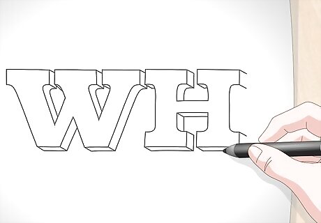
Connect the ends of the diagonal lines together. Use horizontal, vertical, and curved lines to connect the ends of the diagonal lines. This will be drawing the back side of the letters. Think of it like drawing a cube, where you first draw a square, then small diagonal lines, and then connect the lines in another square. It’s just like that, except the shapes are letters instead of squares.
Filling in the Shadows
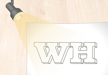
Imagine that your vantage point is a light source. This will help you visualize the way the light and shadow will fall over your letters, so that you can shade them consistently. Making your light source be in the same place as your vantage point simplifies things, but you can choose another place for your imaginary light source if you prefer. It may help to lightly draw a little shining sun in one of the top corners of the page to help you remember. You can erase it later. Most light sources are from above, like the sun, the moon, and overhead lighting, so that will look the most normal. But, you can have the light source be on the bottom if you want the letters to look like they’re behind stage lights.
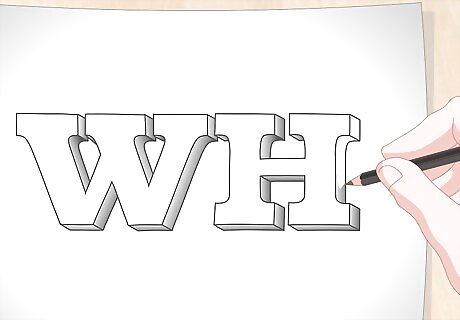
Darken the surfaces away from the light source. Use a dark pencil, pen, or marker, to shade in the surfaces of the letter that face away from the light source, which would be in shade. Leave the surfaces that are facing the light source a lighter color. If your light source is in the upper left corner of your page, all the right hand surfaces of your letters will be dark.
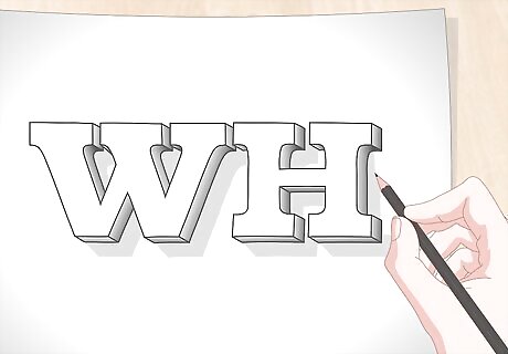
Add cast shadows to the letters, if you’d like. Again, look at where the light source is, and draw the shape of the letter falling away from the light source, onto the imaginary floor. It can be a bit tricky to get the shape of the cast shadow to look realistic, so this step is optional. If you’re adding cast shadow, make sure to also add in cast shadows in holes in the letters. For example, in the letter “R,” one part of the top bit of the letter would cast a shadow on the other bit.
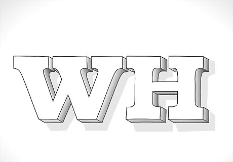
Finished.










Comments
0 comment