
views
Set a goal for your portfolio.

Decide what you want your portfolio to do and who you want it to reach. Are you just starting out as a freelance photographer, or are you applying for an official photography job? It’s super important to figure out who your ideal client is so you can organize your portfolio in the most effective, eye-catching way possible. For instance, the portfolio of a freelance real estate photographer will look a lot different from a portfolio of a photographer applying at a portrait studio. Your portfolio represents who you are as a photographer and what you can offer clients, so it’s really important to decide what your portfolio will be accomplishing.
Pick photos that represent your niche.

A collection of photos without a defined theme won't paint a clear picture for your client. Imagine that you’re hiring someone to take photos of your pets. You go to the pet photographer’s portfolio website, only to find pictures of outdoor landscapes. Without any pet photos on their site, you wouldn’t feel that comfortable hiring them as your photographer, right? The same logic applies when you’re planning out your portfolio—your content has to fit the niche you’re advertising yourself for. If you’re a portrait photographer, you’d include high-quality portraits you’ve taken of kids, adults, and seniors, so clients get a sense of your range. If you’re a wildlife photographer, your portfolio could include a variety of wild animals in different outdoor settings.
Look at other people’s portfolios.
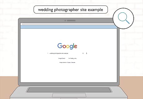
Focus on how they organize their site and showcase their photos. Open up a web browser and search for existing portfolio sites that fit within your photography niche. What types of photos do these photographers feature on their sites? This type of research can help you nail down what your client might possibly like, and what types of photos work well on a live website. Search terms like “wedding photographer site example” or “beautiful wildlife photography portfolio” can bring up helpful results.
Select your best photos.

Your portfolio pictures need to exemplify your skills as a photographer. Bookmark the highest quality photos that match your portfolio niche in a separate folder on your computer. It’s okay if you end up setting aside lots of photos—you can always whittle down your options later. Make sure that your bookmarked photos fit your niche as closely as possible. For example, if you’re a pet photographer who specializes in cat photos, you wouldn’t want to feature a lot of dog pics in your portfolio.
Pick a website builder for your portfolio.
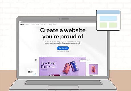
Website builders take a lot of time and hassle out of your website prep. Many of these website builders have preset themes and formats to choose from, so you don’t need any coding know-how to get your site set up. You can make a completely free website if you’re willing to have the name of the website builder in the URL, or you can have your very own domain name for a monthly or yearly fee. Here are a few popular options to choose from: Wix Squarespace Weebly GoDaddy
Settle on a simple website theme.

Your theme needs to present your pics in a stylish but accessible way. Don’t pick out a theme with a distracting background—after all, your photos need to be the star of the show! Instead, pick a theme that meshes well with the aesthetic and purpose of your photography portfolio. Here are a few examples for different photography niches: Wedding: A dark background and white font offset with bright, colorful wedding pictures Portrait: A high-quality portrait used as the main backdrop for your site Documentary: A plain, white background to complement the photo’s complex colors and subject matter
Choose a sleek, readable font.
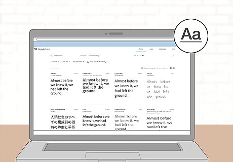
Fancy fonts are no good if your clients can’t read them. Stick with plain, easy-to-read fonts that don’t have a huge size difference between caps and lower case letters. Take a peek at Google’s Web Font directory if you’re thinking about mixing and matching different font styles together. You can check out Google’s font site here: https://fonts.google.com/ It’s hard to go wrong with classic options like Helvetica, Helvetica Neue, Univers, and Avenir.
Shrink your portfolio down to 8-12 photos.

Too many photos can really clutter up your portfolio’s layout. Pull up the folder of high-quality photos that you set aside earlier. Take a really close look at each one—is it the best possible representation of your photography skills, or is there any possible room for improvement? Remove any lower-quality photos from consideration until you have about 8-12 photos leftover. Ask a trusted friend or mentor for help if you’re having trouble deciding which pictures to use.
Structure your pics so they horizontally scroll.

This format works well on both desktop and mobile. Use your website builder’s interface to arrange your photos in a horizontal line, rather than in a vertical line or grid. This way, the user can click or swipe through your pictures and see how each photo connects to the next one. This isn’t to say that other formatting options, like grids, are bad. It really depends on what kind of story you’d like to tell on your website. Most website builders provide plenty of design and layout options that you can play around with.
Organize your photos intuitively.

Each photo needs to have something stylistic in common with the next one. This doesn’t mean that your photos all have to come from the same set or series (though they can if you want!). Instead, make sure all of your neighboring pictures have a similar color palette. Depending on your portfolio niche, you can even organize your photos by mood to create a narrative for the viewer. Some photographers like organizing their photos by composition. In a wedding photo portfolio, you might take a zoomed-in shot of the bride followed by a zoomed-out shot of the bride and groom together.
Label each photo with captions and alt text.
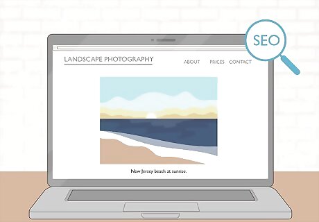
Captions and alt text help with your website’s search engine optimization (SEO). SEO is all about boosting your portfolio site’s ranking on search engine result pages (SERP). Image captions and alt text not only make your site more accessible, but they also give search engines more helpful information about your site—this helps it rank higher on the SERP. Make sure to include captions and alt text for each photo on your portfolio site so it’s more likely to show up in Google searches. Alt text is a short description embedded into a photo that’s automatically read out loud to visually-impaired users. Most website builders have built-in features that let you easily add it to photos. A portfolio picture of an open beach might have alt text that reads “New Jersey beach at sunrise.”
Describe yourself on an “about” page.

Let potential clients know what makes you special as a photographer. Include a professional headshot on the page, and explain what photography means to you. If you’d like, give a little background on how you started as a photographer, and explain how you have the experience and skill to bring their vision to life. You might write: “I graduated from Brigham Young University in 2017 with a BFA in Photography, but my passion for capturing the world around me started much earlier on.” “To me, photography isn’t about freezing a moment in time—it’s about capturing a story on film for years to come. I want to help bring your story to life.”
List your prices on a separate page.
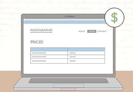
Potential clients don’t want to dig around to find your rates. Label a page on your website as “Prices,” and include what you usually charge for your photography sessions. If you haven’t quite settled on a price yet, check out other photographers’ rates. As a reference point, the median hourly rate for a photographer is $20.
Put your info on a “contact” page.
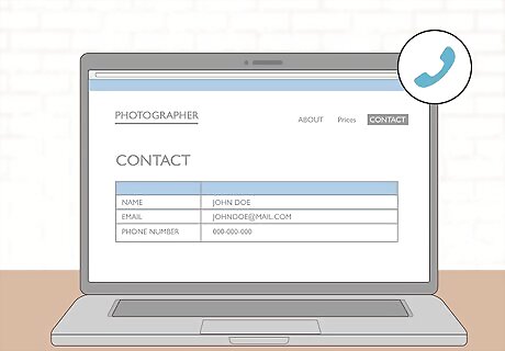
Include your email, phone number, and any other important details. Create another page on your website labeled as “Contact.” List out your professional email, phone number, and address, if you work at a specific location. Many website builders let you build a contact form into your website, which gives site users another way to reach you.
Test the site on different platforms.

Make sure it works on computers, phones, and different web browsers. Are the photos easy to access and view, and is it simple to switch between tabs/pages? There’s a good chance that clients will find your portfolio site from both their computers and phones, so it’s important that your site is mobile-friendly. Most website builders have a preview function, so you can inspect it before it goes live.
Publish your site.

Promote your site online and give the URL to potential clients. Post the link on social media, and invite your friends, loved ones, and acquaintances to share it around. To get more client traffic, include the link on your business cards and other promotional materials.


Comments
0 comment