views
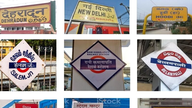
Simple language, clear font, easy-to-see colours and intuitive pictograms will now be the new standard for signages at railway stations across the country. The Ministry of Railways on Monday released a booklet on ‘Standard signages at stations on Indian Railways’ and said the display of station names will be standardised.
According to the ministry, more than 7,300 railway stations in 17 zones and 68 divisions across Indian Railways have different styles of signages. But, the display of names of stations will now be designed on the same standard across the country. The ministry said requirements of all passengers were kept in mind while designing the standards.
“The colours of signages, type and size of fonts have been standardised. Concept of grouping of signages has been introduced for faster wayfinding. New tertiary boards displaying station names with tricolour backgrounds have been introduced. Emphasis has been laid on providing intuitive wayfinding and availability of signages on key decision making points,” an official statement read.
The ministry further said while there was emphasis on standardisation, the need for flexibility in case of stations with strong architectural vocabulary has also been recognised. The booklet read that a large station has its own specific layout and requirements, and there can be a detailed analysis on a case-to-case basis.
“For different types of trains or traffic segments like MG/BG (meter gauge/broad gauge), local/long distance, EMU/mail express etc, different colour schemes will be used for wayfinding of different train type/traffic segments for ease of passengers. Accordingly, all the identification and direction board, which is usually white text in dark blue background, may be changed with suitably selected colour pattern for that particular category of train or traffic segment,” the booklet said.
The booklet has mentioned in detail the different pictograms to be used along with the text for a better understanding. Directional arrows have been made mandatory almost everywhere. It said the font size must be suitably selected to achieve the required character height depending upon the expected viewing distance.
The signages used should gel with the station architecture and inputs should be taken from station architects. Also, the station name boards over the buildings should match with the architectural vocabulary, the booklet said.
The ministry also said the signage board layout plan for stations will be prepared by a committee nominated as well as finalised by the divisional railway manager (DRM). Further, the effectiveness of these signage layout plans will be periodically reviewed via inspection groups, it added.
While releasing the booklet, railway minister Ashwini Vaishnaw said this was a part of the ministry plan to enhance passenger experience. “Today, I am delighted to release the booklet on ‘Standard signages at stations on Indian Railways’. The Indian Railways will adopt modern, standard signages that are divyang friendly,” he added.
Indian Railways has the largest number of stations than any other rail network in the world.


Comments
0 comment