views
Creating a Box and Whisker Plot
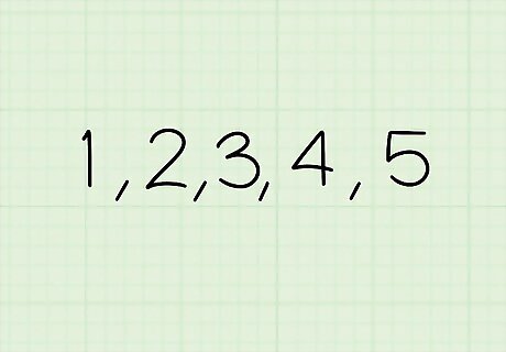
Organize the data set from least to greatest. Take all the numbers from your set of data and line them up in order, so that the smallest numbers are on the left and the largest numbers are on the right. Example 1: Organize the data set “2, 5, 1, 3, 4” to get “1, 2, 3, 4, 5.” Example 2: Reorder the data set “18, 39, 19, 34, 28, 78, 22, 24” to get “18, 19, 22, 24, 28, 34, 39, 78.”
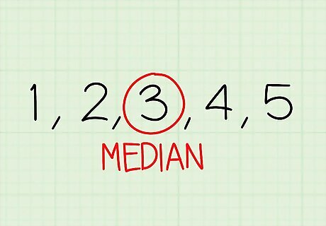
Find the median, or the second quartile (Q2), of the data set. Cross out one number on each side of the data set to find the middle number, or the median. If you have an even amount of numbers in your data set, add the two middle numbers together and divide the answer by 2. Example 1: The median of “1, 2, 3, 4, 5” is 3. Example 2: The median of “18, 19, 22, 24, 28, 34, 39, 78” is 24 and 28. 24 + 28 = 52 52 / 2 = 26. The median is 26.
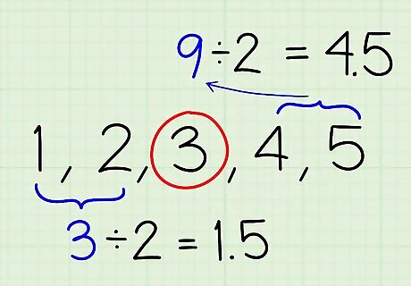
Find the first and third quartiles (Q1 & Q3) by dividing the data in 2. The median marks the middle of the data set, dividing the numbers into a lower region and an upper region. Find the median of the numbers in the lower region to get the first quartile (Q1), then find the median of the numbers in the upper region to get the third quartile (Q3). Example 1: Since the median is 3, the lower region is 1 and 2 and the upper region is 4 and 5. The median of each is “1 and 2” and “4 and 5,” so add both numbers and divide by 2. Q1: 1 + 2 = 3 and 3 / 2 = 1.5 Q3: 4 + 5 = 9 and 9 / 2 = 4.5 Example 2: The median is between 24 and 28, so the lower region is “18, 19, 22, 24” and the upper region is “28, 34, 39, 78.” The median of each region is “19 and 22” and “34 and 39,” so add both numbers and divide by 2. Q1: 19 + 22 = 41 and 41 / 2 = 20.5 Q3: 34 + 39 = 73 and 73 / 2 = 36.5
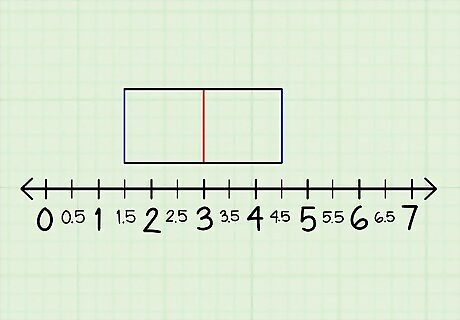
Draw a number line and connect the quartiles to make a box. Draw a long horizontal line and number it evenly from 0 to a number above the highest number in your data set. Plot Q1, Q2, and Q3 above the line with small vertical lines. Connect the top and bottom of the first quartile to the top and bottom of the second and third quartiles to make a box. If you're dealing with decimals like 1.5 or 20.5, label them on the number line as well. Optionally, label each quartile line as Q1, Q2, and Q3.
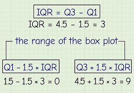
Find the interquartile range (IQR) and plot outliers on the number line. Find the IQR by subtracting Q1 from Q3. Use the formulas Q1 - 1.5 x IQR and Q3 + 1.5 x IQR to find the range of the box plot. If a number goes outside of this range, then it’s an outlier. Mark outliers as dots on your number line below the box plot. Example 1: Q3 - Q1 = IQRQ1 = 1.5 and Q3 = 4.54.5 - 1.5 = 3, so the IQR is 3. Q1 - 1.5 x IQR = the lower part of the range and Q3 +1.5 x IQR = the upper part of the range.1.5 - 1.5 x 3 = 04.5 + 1.5 x 3 = 9 The range of the box plot is 0 to 9 or [0, 9]. The lowest number (1) and the highest number (5) in the data set both fit in that range, so there are no outliers. Example 2: Q3 - Q1 = IQRQ1 = 20.5 and Q3 = 36.536.5 - 20.5 = 16, so the IQR is 16. Q1 - 1.5 x IQR = the lower part of the range and Q3 + 1.5 x IQR = the upper part of the range.20.5 - 1.5 x 16 = -3.536.5 + 2.5 x 16 = 76.5 The range of the box plot is -3.5 to 76.5 or [-3.5, 76.5]. The lowest number (18) fits in that range, but the highest number (78) doesn’t. Plot 78 as a dot along the number line.
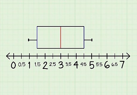
Draw horizontal lines to the highest and lowest numbers. Plot the highest and lowest numbers within the range of the box plot as small vertical lines above the number line. Connect those lines to the sides of the box plot to create “whiskers.” If you have outliers, connect the next number within the range to the box plot. Example 1: Plot 1 and 5 as small vertical lines slightly above the number line, then connect them to the box plot. Example 2: Plot 18 as a small line above the number line. Since 78 is an outlier, plot the next lowest number, 39, as another small line. Connect both to the box plot.
Benefits of a Box and Whisker Plot
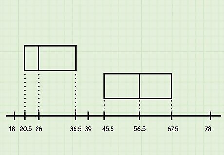
Box and whisker plots make it easy to identify data trends. The box plot, representing the averages of the data set, shows where the data is concentrated along a number line. Not only can show you the general trend of the numbers you collected, it can also make it easier to compare multiple sets of data to each other. If the second example we used above represents the age of people who attend music festivals, you can tell from a glance that most people are ages 20.5 (Q1) to 36.5 (Q3) and the average age is 26 (Q2). We could then compare this box plot to another one, which says that most people are ages 45.5 (Q1) to 67.5 (Q3) and the average age is 56.5 (Q2), and see a huge difference between the two.
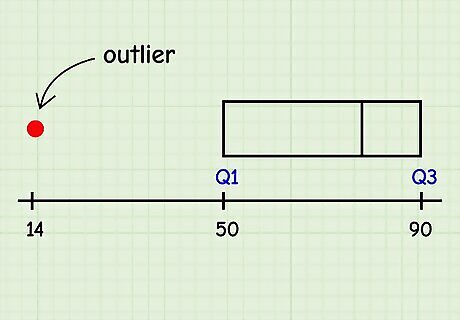
Box and whisker plots show outliers in your data set. While many charts and graphs choose to leave them out completely, box and whisker plots show outliers as points along the same number line. Outliers can be important for professionals like scientists and psychologists because they reveal other patterns that might otherwise go unnoticed. There might be an illness that targets people between ages 50 (Q1) to 90 (Q3), but an outlier could be 14 years old. Scientists might then investigate why the 14-year-old got sick. Box plots are also useful for any professional who uses statistics, like research analysts, forensic technicians, and researchers. Meteorologists also use box plots.
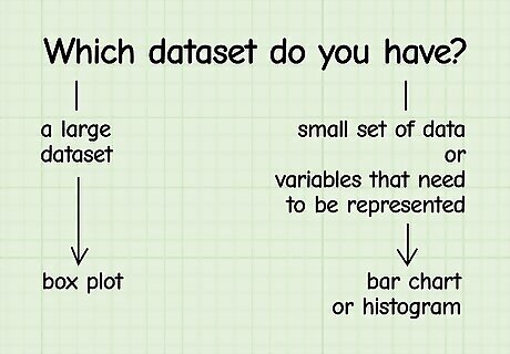
Box and whisker plots are good for representing lots of data. Math teacher Joseph Meyer says that a box and whisker plot can be a great alternative to a bar graph or histogram because it’s “more about the quartiles” and represents “where everyone's falling” on a number line. While bar graphs and histograms represent values in certain categories, box plots give you a summary of a large amount of data. However, if you have a smaller set of data or variables that need to be represented, use a bar chart or histogram instead. Box and whisker plots also take up much less space than other charts and graphs. EXPERT TIP Joseph Meyer Joseph Meyer Math Teacher Joseph Meyer is a High School Math Teacher based in Pittsburgh, Pennsylvania. He is an educator at City Charter High School, where he has been teaching for over 7 years. Joseph is also the founder of Sandbox Math, an online learning community dedicated to helping students succeed in Algebra. His site is set apart by its focus on fostering genuine comprehension through step-by-step understanding (instead of just getting the correct final answer), enabling learners to identify and overcome misunderstandings and confidently take on any test they face. He received his MA in Physics from Case Western Reserve University and his BA in Physics from Baldwin Wallace University. Joseph Meyer Joseph Meyer Math Teacher Box plots provide a clear way to display data. These plots, also called whisker plots, display the spread of your data concisely by using quartiles. They work particularly well to compare distributions across multiple datasets. However, histograms offer a more detailed picture of the data's entire distribution.


Comments
0 comment